My Portfolio
Come on in, I'll show you around

Why tell you... When I can show you?
These are my favourite projects I've worked on, ranging from recent to... well, less recent!
Every single piece has been designed to connect the audience with the products - and the lovely companies that make them - on a deeper level.
I don't write "wants", I write desires.
I don't do "makes life better", I do "can't live without".
What can I say? I love what I do, and so do my clients!
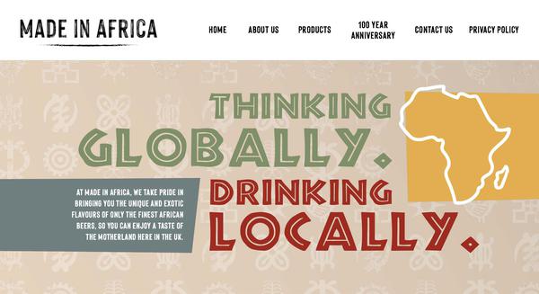
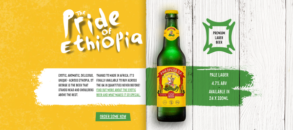
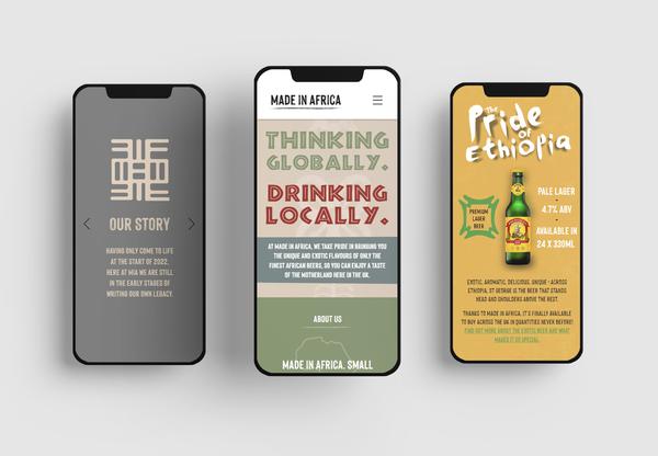
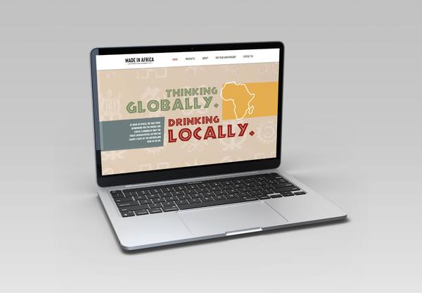
Made in Africa Website
My most recent project was helping to design and write copy for a brand new website!
The copy is designed to bring you into a world of exotic alcohol, intoxicating the readers and causing cravings for a taste of something unique.
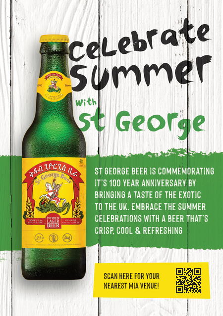
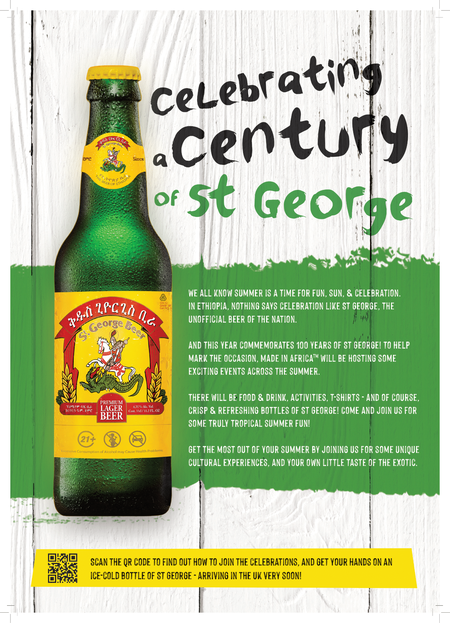
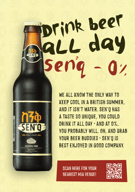
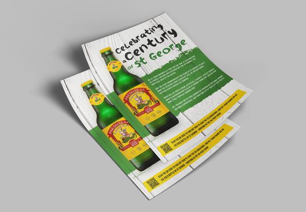
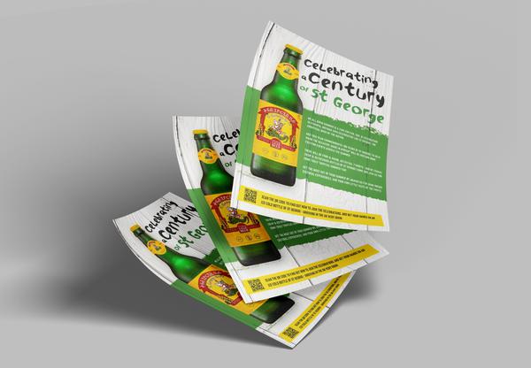
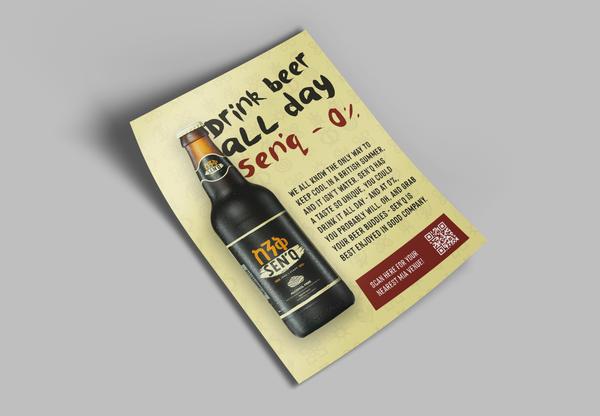
Made in Africa - Poster
This poster went through several different phases before the final product was ready!
Given only a small amount of time to convert a double-sided flyer into a single-sided poster, I worked tirelessly to reduce the word count without diluting the message.
All things considered, the end product works really quite well. The message is clear, benefits clearer, with a QR code-CTA that works for the format and the modern era.
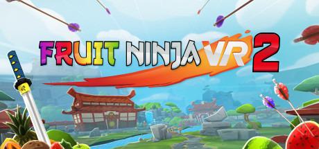
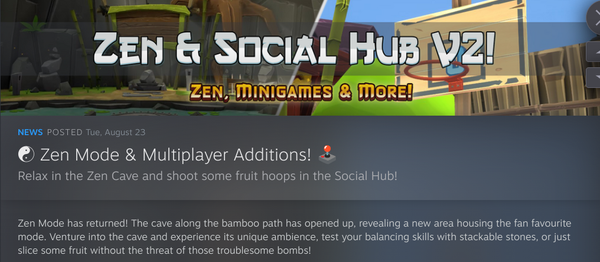
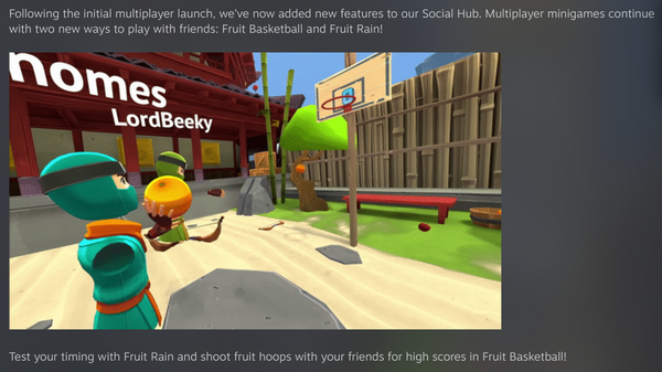
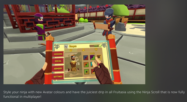
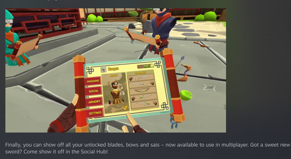
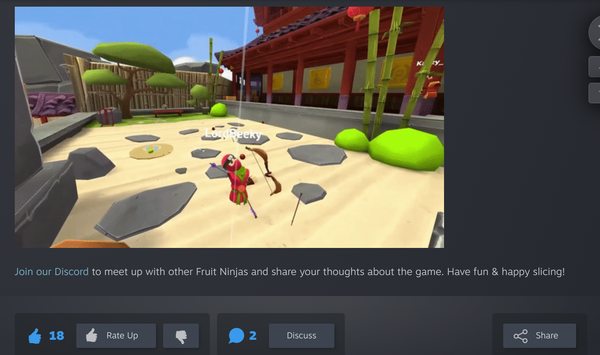
Halfbrick/Fruit Ninja VR 2 News & Content Releases
It's always a pleasure to write on behalf of Halfbrick! Anyone who knows me knows I love gaming, so to be able to rep one of my favourite games of all time is amazing.
The copy is designed to excite the audience, as we're talking about new and fun additions to the game. This post alone got triple the interactions they usually get!
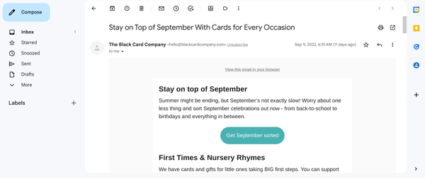
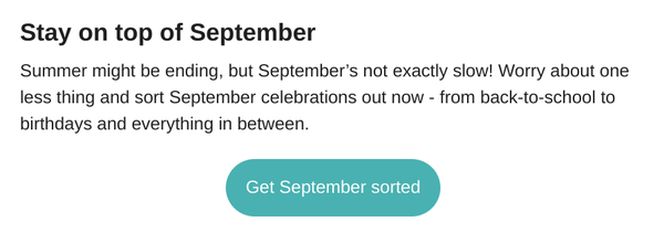
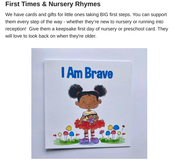
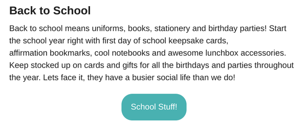
Black Card Company Newsletters
The Black Card Company had never had a newsletter before, and would've had one for a long time if it weren't for time constraints.
Together we worked out the best way to appeal to a collective client base, and constructed a monthly newsletter formula that has seen them increase revenue month on month in sales!
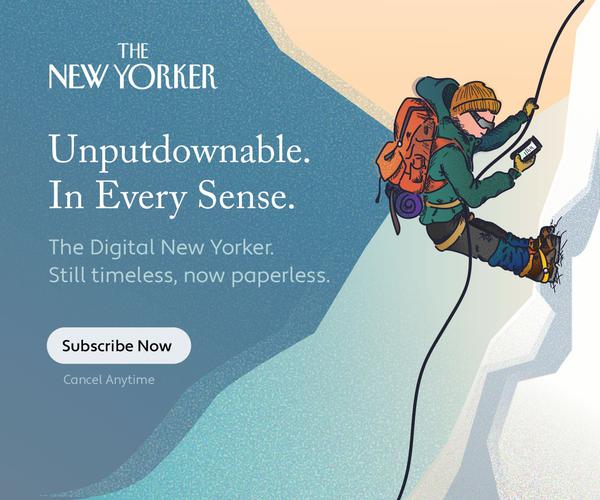
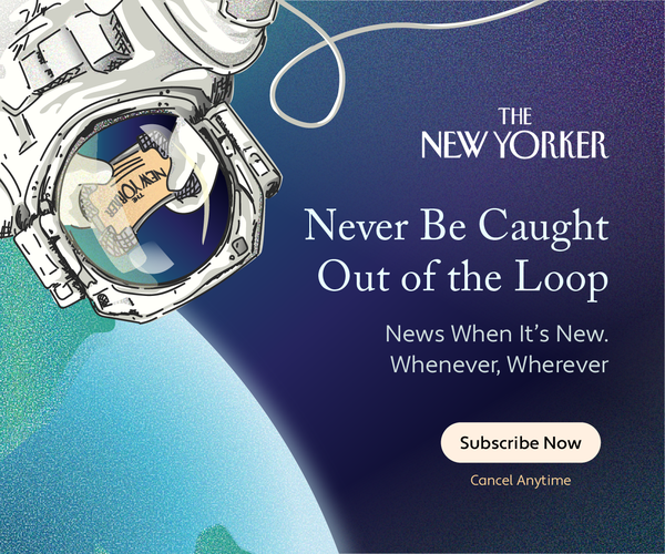
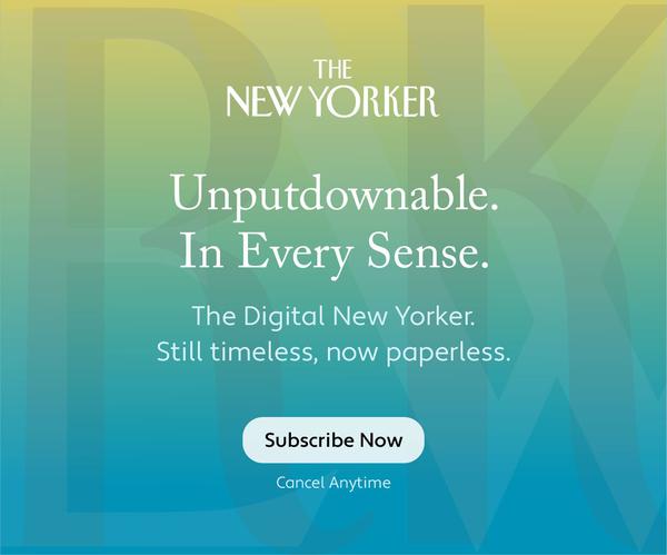
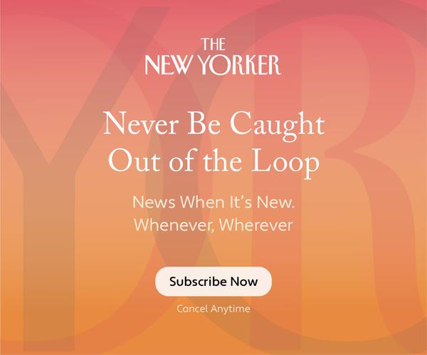
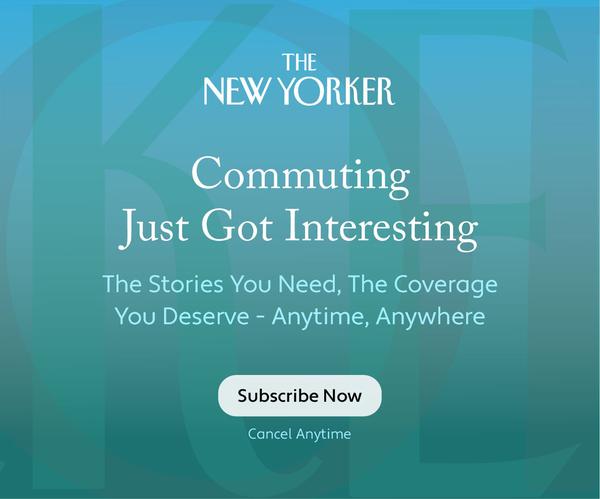
The New Yorker Banner Ad - Spec Piece
The New Yorker is an illustrious magazine with a stellar reputation for high quality journalism across all topics.
The goal for this particular spec piece was to encapsulate that, and advertise it alongside their new digital format.
Combining the benefits of mobile accessibility and the reputation of The New Yorker is what makes this ad work, as well as using the right amount intrigue via design and copy.
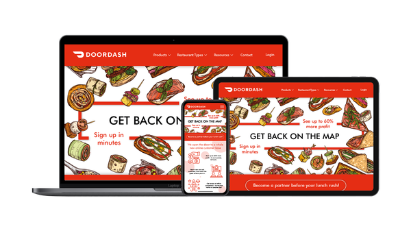
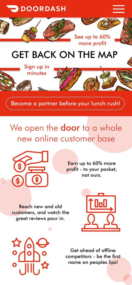
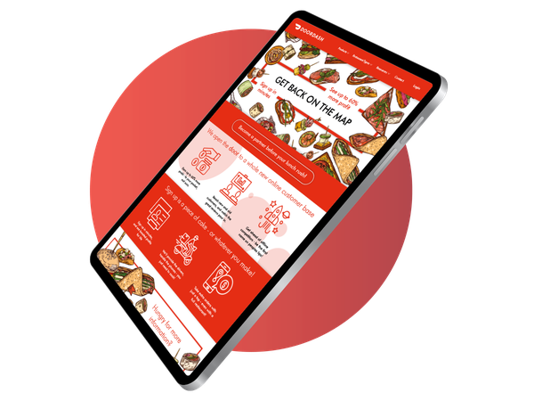
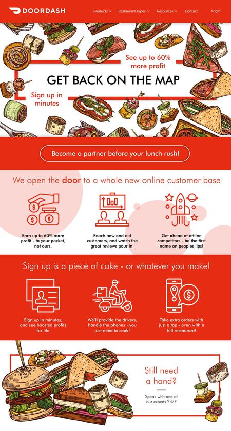
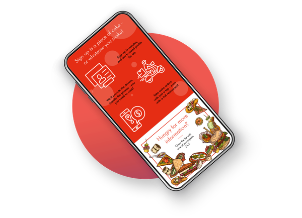
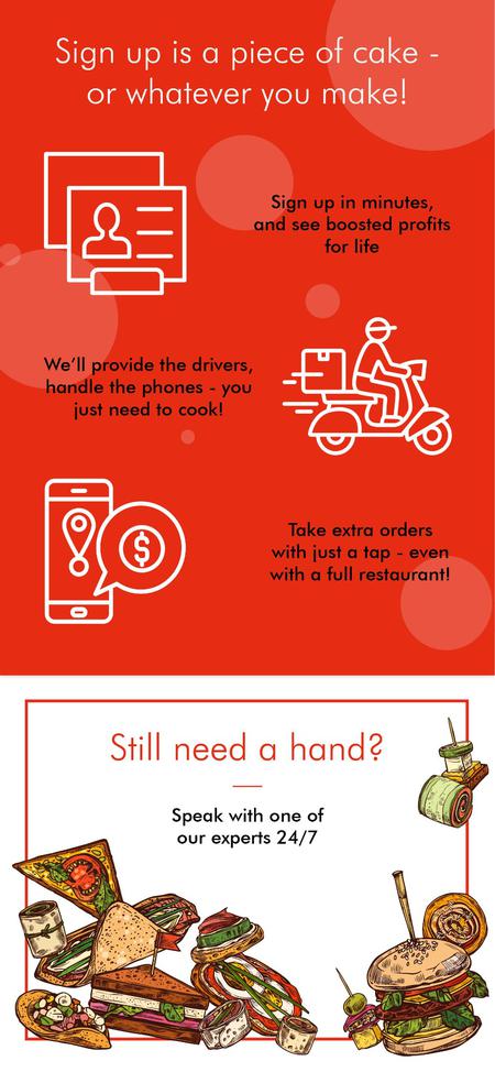
DoorDash LP - Spec Piece
The goals for this Spec Piece were to craft copy for a landing page, capable of converting someone from not using online services to support their business, to believing that this is the way forward.
The copy is tailored for smaller businesses and breaks down simply and clearly all the benefits of utilising DoorDash - all whilst remaining transparent and easy to use, helping engage potential customers even further.
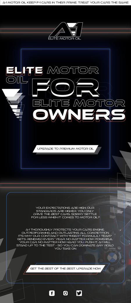
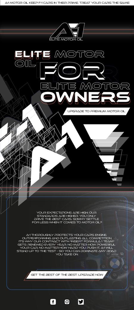
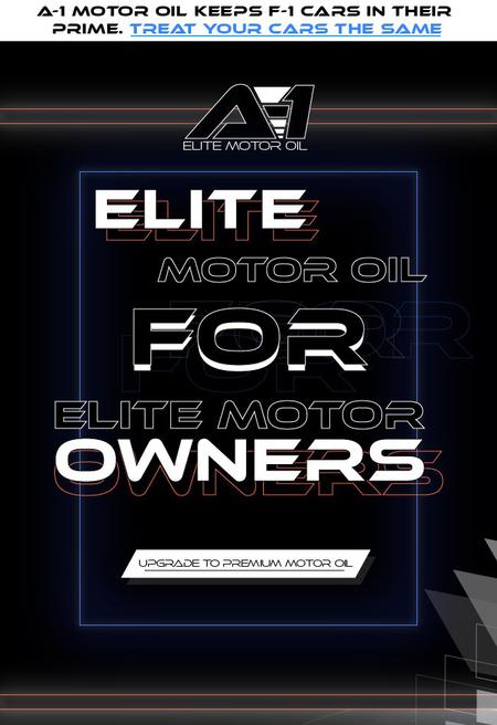
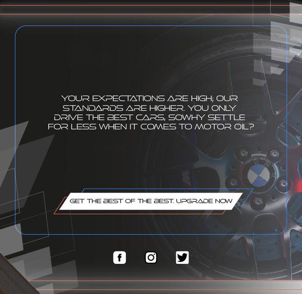
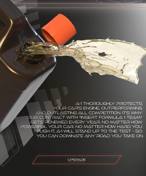
A-1 Motor Oil Email - Spec Piece
The primary objective of this email was to get customers to upgrade after understanding that this is the best possible motor oil in the business.
I used a popular reference (F1) to help boost the brand, without namedropping to remain mysterious and "elite".
The deep benefit of potentially using the same product as Hamilton or Verstappen, combined with the language and design, reinforces the fact that it doesn't get better than this.
This email does a great job of reaching the target audience and addresses them as elite, leading them to believe that they need to purchase this product in order to protect that status.
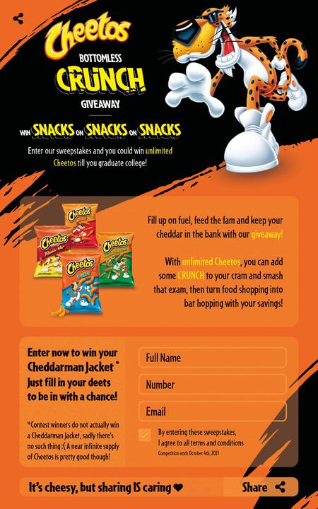
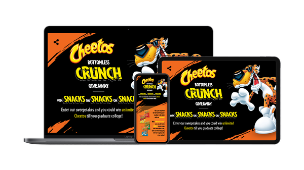
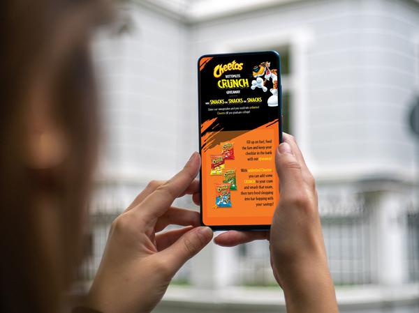
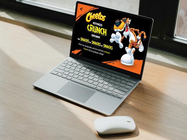
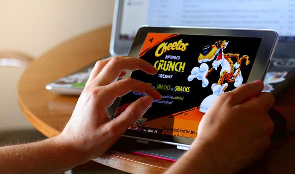
Cheetos Landing Page - Spec Piece
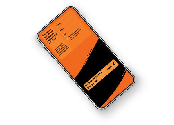
The main goal of this spec piece was to get the TA - that is, college students - to fill in their details.
This was achieved with targeted copy, using thoroughly researched terminology so I didn't look out of touch with the kids, haha!
Just to be thorough, I had this piece reviewed not only by my peers, but actual University students - and the feedback was great all-round!
Like what you see?
Get in touch & we can discuss your project.
Read a bit about me
& learn why I'm the copywriter for you!
